Tuesday, August 15, 2017

What is the key purpose of a Business Card and has this changed?

I have a collection of business cards with some that are decades old. You may have a stack too, a collection from a recent event, a meet up, conference or convention.
Each business card is different if you go through them some you keep others you may toss. Those you keep it is likely all contain similar elements and have readability. This means the typeset words can be easily and quickly read.

Today many methods exist to contact a person. Arguments abound on what kind information is best or important to include on a business card. Some argue a P.O. Box is bad to use for an address. Card design exist with the entire card crammed with information, from Facebook, linkedin, Skype,  the card can end up looking like a newspaper article.

Here is my take on the Key Purpose of a Business Card

1. Conveys Contact Information
Above all else, a business card is a tangible object that’s used to provide your contact information to potential customers. Because of this, most business cards contain your name and title, your telephone number, an email address. Other key information includes; the business name, and a street address, a office phone too is ok especially if you have a reception desk to answer. Your company has a website, so included the URL address so that customers can receive more detailed information through it. A fax number only if you and customers use it weekly. When was the last time you sent or received a fax? The company logo is ok, it needs to be a balanced part of the card design. That means it is a small design element.

2. Helps Customers Remember You
While a business card conveys the means for customers to be in touch with you, a business card also serves as a way for customers and colleagues to remember you after a first meeting. Different strategies and practices are used. Some like to go with a lines or completely blank back, so that you or recipient can make a note on the card back. Sometime the business card has a unique or catchy tag line on the card back to jog customers’ memories about the circumstances of their meeting. These strategy can be a mnemonic tool to help customers recall meeting you, then merely by the name on the card, your handshake and smile.

3. Reflects Your Company's Values
A business card is a piece of your company’s marketing plan, albeit a small one, so it should work with existing materials, such as letterhead and envelopes and other supporting marketing communications collateral. A card is designed to convey the spirit of your company’s culture. Consistency is good, the same logo, company typeface, company colors are applied across visual media. The correct paper card stock is used, matching on stationery items . All materials should look related, seem to be a set.

4. Differentiates You From Competition
It’s almost a given that your customers receive several business cards from your competitors. A consistent look of all marketing communication collateral, including stationery and your smartly designed business card helps your company stand out among the crowd. Some entrepreneurs choose to use die cuts to create unusual shapes for their card, while others use perforations, folds and pop-ups to differentiate themselves. You don’t need to resort to gimmicks; a concise, direct and visually appealing and readable card that projects your company’s identity is as effective in differentiating a company as a novelty card.

Key Purpose of a Business Card

You may have a collection of business cards from decades of business, or you just came back from a event, a convention, a meet up group with a new business card collection. As you look through them, each is different, the good ones, the ones you keep it is likely they all contain similar information elements, ultimately readability is key.

In a recent conversation during a business card design review, several employees that had not been a part of the company logo and identity program from the beginning of the graphic design process were brought in the room. This group of people had not been part of the discovery research process, the strategy development, the design development, all the many meetings and reviews that had previously occurred. None had any awareness of the goals, or objectives that had been agreed upon as part of the project proposal, design brief  or what the graphic design project deliverables were.

Tuesday, January 31, 2017

MS Word questions asked that are not about MS Word #3

A great many question get asked relating to but are not always directly about MS Word.

1. “What is the best cursive font in Microsoft Word?”
2. “What style of font is the smallest in Microsoft Word?”
3. “Is there a calligraphy font for Microsoft Word?”

These are three recent great questions. This post will be about the third question.

Question 3. Is there a calligraphy font for Microsoft Word?


The answer could be


Microsoft Word is at its core a word processing application. It can display your text files using any typeface installed on your computer.
This includes typefaces in the Script, Text, or Special classifications. Within these typeface classifications some fonts can be set to appear as the scribe‘s meticulous handwriting with pen and ink to form “calligraphy”.


The selection of typefaces you see when using Microsoft Word exist as part of your computers operating system. That is to say these are typefaces that have been loaded or installed onto your computer. 

Some of the typeface choices you see came with the operating system, others as part of Microsoft office or other installed applications. You may have purchased a single font or a whole typeface family and installed it as well.

Some links to font resources

Monday, January 30, 2017

MS Word questions asked that are not about MS Word #2

A great many question get asked relating to but are not always directly about MS Word.

1. “What is the best cursive font in Microsoft Word?”
2. “What style of font is the smallest in Microsoft Word?”
3. “Is there a calligraphy font for Microsoft Word?”

These are three recent great questions. This post will be about the second question, sent by Anastasia P.

Question 2. What style of font is the smallest in Microsoft Word?


First understand that no fonts exist in the Microsoft Word application. The selection of fonts you see when using Microsoft Word exist as part of your computers operating system. That is to say these are typefaces that have been loaded or installed onto your computer. Some of the typeface choices you see came with the operating system, others as part of Microsoft office or other installed applications. You may have purchased a single font or a whole typeface family and installed it as well.

When you ask “What style of font is smallest” I am going to guess that your not asking about the point size of the type. As you can make any type display at a small point size, such as 6 pt.

My best guess your asking about the typefaces perceived size, this is result of the typefaces X-height.
Type is measured by the height of the characters. Imagine a box that is bounding the typeface characters, it includes any descenders such as on the lower case p, g,or y font characters, and any ascender’s such as h, d, f and the uppercase letters, this is the body size or the character image height, also called the type size.
Type used to be predominantly made of metal, and the metal typeface sizes were measured in points, (Point (typography) - Wikipedia) and each type font point size was designated by the size of the metal block or slug on which the type was cast. The result was the image height (body size) of the metal typeface character is smaller than the vertical size of the metal slug or block that carries the character.
So if you have different typefaces all set at same point size (metal slug or block size) they can look different. Because within the bounding box the proportions of the characters can vary widely from typeface to typeface. The vertical height of a lower case n, s, or x will be different from typeface classification to typeface classification. This measure is the “x” height.

The x-height is a major factor influencing the perceived size of a typeface.

X-height is the distance from the type baseline to the mean line (top of non ascending lowercase letters) This x-height distance varies between typefaces style classifications, and it has migrated to be taller over the centuries. This design change has been driven by studies. It turns out over 75% of the text we read is lowercase letters. Contemporary text typeface designs that have characters with larger x-heights have tested as more legible. Type design with larger x-height are efforts to increase legibility.
You can see in the graphic below the x-height and type-size difference in the key typeface classifications. 


So a font that may work for you at 8pt or smaller point sizes could be a contemporary typeface design with a x-height that is larger. Versions of Microsoft Office might have installed a couple of these typefaces. Both Verdana and Trebuchet are san serif typefaces of recent design, both with larger x-height as compared to Palatino a old style design, all which may be Microsoft Office installed typefaces.


The last line is 6pt type in each above example, at this size the typefaces with larger x-height still have good legibility.

The reading process can be enhanced or inhibited by the legibility and the readability of the typography. Setting type there is lot involved to do it professionally.

Word processing programs such as Microsoft Word do not give you the actual typesetting control that Adobe InDesign or Quark Express do. For common business communication; letters, many reports and proposals MS Word might be adequate. For quality work; ads, brochures, invitations, annual reports, posters, flyers, booklets, books, magazines, logos, these items require graphic design and type that needs to be set with great care. The programs like InDesign, Quark, and Illustrator have tools that set type and allow expert level of control and in a professional graphic designers hands can be made to produce proper files for print reproduction. 

I not sure if this is answering your “font is the smallest” question or even giving you better tools and understanding to ask the right question, I hope so.
The best thing is to try stuff, test and experiment in your MS Word document with the typefaces you have available on your computer. For the MS Word projects that need small text sizes ( 6 pt–4 pt) try using the Verdana font to start with in your style.

Friday, January 27, 2017

MS Word questions asked that are not about MS Word

A great many question get asked relating to but are not always directly about MS Word.

1. “What is the best cursive font in Microsoft Word?”
2. “What style of font is the smallest in Microsoft Word?”
3. “Is there a calligraphy font for Microsoft Word?”

These are three recent great questions. This post will be about the first question.

Question 1. What is the best cursive font in Microsoft Word?

Cursive is a style of penmanship.

Font, many define font as a particular size, weight, and style of typeface.

The classification of typeface family that has a look of handwritten-cursive or hand-printed or hand-lettered is Script. 

Of Script typeface designs many are of a similar appearance to handwritten-cursive, and are sub categorized as Flowing Script. Great variation exists within the Script and Flowing Script classification.

Microsoft Word is at its core a word processing application. It can display your text files using any font installed on your computer. So if you have Edwardian Script or Flemish Script typeface fonts installed on your computer you get a very uniform appearance (see two samples below). These type sample blocks are created not with MS Word but using Adobe Illustrator.

Edwardian Script
Flemish script


Many other flowing script typeface families are available so you can achieve a very formal, or light & elegant, or a bit rougher handwritten look such as Baker Script (below)

In just these three samples you can see variation exists, and each has it own type color or visual texture and each a different legibility and readability.

To find a look like a handwritten cursive letter, I would suggest you focus your typeface research on typefaces under the Script Classification to begin. 
A list of a couple dozen Flowing Script typefaces not yet mentioned you might consider to look at and research the following:


Wednesday, January 18, 2017

What typefaces are most similar to Garamond?

This query came via email

What typefaces are most similar to Garamond?

Some would be typefaces frequently classified as Oldstyle.
Caslon, Bembo, Berkeley, Berling, Galliard, Goudy, Times, Minion, Palatino, Venetian, Weiss.


These all have similarities, letters are open with serifs and marked contrast between thick and thin strokes.
Many other typefaces exist to explore in the oldstyle classification. It can be hard to choose.
Garamond is a favorite typeface to work with.

More about Oldstyle

Oldstyle typefaces tend to have a warm, graceful appearance. Styled after classic Roman inscriptions, their characteristics developed out of the traditional hand lettering form of scribes printing with a broad tipped pen held at an angled.


Moveable type developed mid 1400, the first letterforms resembled what was familiar the traditional hand lettering form. Very big books were what were printed, and predominantly these were books read out loud. The printed books typefaces had to be readable.

Oldstyle typeface design objective was for setting readable, lengthy bodies of text. This design characteristic of oldstyles make them so the the typography is transparent to the reader. The character forms don’t interrupt the communication, they are “invisible” and don’t trip the eye when reading.

Oldstyle typefaces have serifs. Upon close examination of the lowercase serifs you see slant and serifs connect to the main strokes with a curve. This is “bracketed”.

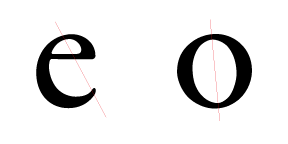
The strokes made a gentle transition from thick to thin, like the broad tipped pen made. Looking at the e, o, the bowl and counter of the p and d, note the thinnest parts of these rounded forms. When thinnest parts are connected by a diagonal line, this angled line is called the stress, oldsyle typefaces have a diagonal stress.

old style lowercase e and o with diagonal stress line through thin parts of letter strokes


Oldstyle typeface classification is a good choice when setting continuous blocks, pages of set type that people can read.


What are some fonts like Myriad Pro?

This query came via email
What are some fonts like Myriad Pro?

Myriad Typeface Family
Many san-serif fonts exist, and that is a broad category for Myriad Pro. It can be further classified as humanist sans-serif. It is a recent font and has its roots as mentioned in Friutiger. Gill Sans is another san-serif font influence, same can be said of Helvetica, Optima, all fonts that were in use and existence before Myriad first release in the 1990’s as a Adobe multiple master font, Myriad MM.
Some other similar fonts Segoe UI and Microsoft humanist sans-serif typeface Corbel.
Myriad Pro works as a printed font and works well as legible screen font. Segoe UI, Corbel also are considered legible screen fonts, in that category you could include some other fonts (commissioned by Microsoft or used in office) humanist san-serif;

  • Calibri
  • Candara
  • Tahoma
  • Trebuchet MS
  • Verdana


Another humanist sans-serif legible screen font worth mention is Lucida Grande, this was a Mac OS interface font until couple years ago.
After you check out the listed humanist sans-serif typeface might look into the fonts;
  • Univers (also a Adrian Frutiger design like Friutiger), 
  • San Francisco, 
  • Helvetica, 
  • Folio 

These are all classified neo-grotesque san-serif. 
San Francisco a very recent design too (original 1984 released again 2014 as system typeface), the others all released before Myriad Pro.

Fonts like Myriad Pro are first of the many other humanist sans-serif fonts that work as legible screen fonts, and second those humanist and neo-grotesque san-serif fonts that laid the foundations for it as print fonts.