Tuesday, January 31, 2017

MS Word questions asked that are not about MS Word #3

A great many question get asked relating to but are not always directly about MS Word.

1. “What is the best cursive font in Microsoft Word?”
2. “What style of font is the smallest in Microsoft Word?”
3. “Is there a calligraphy font for Microsoft Word?”

These are three recent great questions. This post will be about the third question.

Question 3. Is there a calligraphy font for Microsoft Word?


The answer could be


Microsoft Word is at its core a word processing application. It can display your text files using any typeface installed on your computer.
This includes typefaces in the Script, Text, or Special classifications. Within these typeface classifications some fonts can be set to appear as the scribe‘s meticulous handwriting with pen and ink to form “calligraphy”.


The selection of typefaces you see when using Microsoft Word exist as part of your computers operating system. That is to say these are typefaces that have been loaded or installed onto your computer. 

Some of the typeface choices you see came with the operating system, others as part of Microsoft office or other installed applications. You may have purchased a single font or a whole typeface family and installed it as well.

Some links to font resources

Monday, January 30, 2017

MS Word questions asked that are not about MS Word #2

A great many question get asked relating to but are not always directly about MS Word.

1. “What is the best cursive font in Microsoft Word?”
2. “What style of font is the smallest in Microsoft Word?”
3. “Is there a calligraphy font for Microsoft Word?”

These are three recent great questions. This post will be about the second question, sent by Anastasia P.

Question 2. What style of font is the smallest in Microsoft Word?


First understand that no fonts exist in the Microsoft Word application. The selection of fonts you see when using Microsoft Word exist as part of your computers operating system. That is to say these are typefaces that have been loaded or installed onto your computer. Some of the typeface choices you see came with the operating system, others as part of Microsoft office or other installed applications. You may have purchased a single font or a whole typeface family and installed it as well.

When you ask “What style of font is smallest” I am going to guess that your not asking about the point size of the type. As you can make any type display at a small point size, such as 6 pt.

My best guess your asking about the typefaces perceived size, this is result of the typefaces X-height.
Type is measured by the height of the characters. Imagine a box that is bounding the typeface characters, it includes any descenders such as on the lower case p, g,or y font characters, and any ascender’s such as h, d, f and the uppercase letters, this is the body size or the character image height, also called the type size.
Type used to be predominantly made of metal, and the metal typeface sizes were measured in points, (Point (typography) - Wikipedia) and each type font point size was designated by the size of the metal block or slug on which the type was cast. The result was the image height (body size) of the metal typeface character is smaller than the vertical size of the metal slug or block that carries the character.
So if you have different typefaces all set at same point size (metal slug or block size) they can look different. Because within the bounding box the proportions of the characters can vary widely from typeface to typeface. The vertical height of a lower case n, s, or x will be different from typeface classification to typeface classification. This measure is the “x” height.

The x-height is a major factor influencing the perceived size of a typeface.

X-height is the distance from the type baseline to the mean line (top of non ascending lowercase letters) This x-height distance varies between typefaces style classifications, and it has migrated to be taller over the centuries. This design change has been driven by studies. It turns out over 75% of the text we read is lowercase letters. Contemporary text typeface designs that have characters with larger x-heights have tested as more legible. Type design with larger x-height are efforts to increase legibility.
You can see in the graphic below the x-height and type-size difference in the key typeface classifications. 


So a font that may work for you at 8pt or smaller point sizes could be a contemporary typeface design with a x-height that is larger. Versions of Microsoft Office might have installed a couple of these typefaces. Both Verdana and Trebuchet are san serif typefaces of recent design, both with larger x-height as compared to Palatino a old style design, all which may be Microsoft Office installed typefaces.


The last line is 6pt type in each above example, at this size the typefaces with larger x-height still have good legibility.

The reading process can be enhanced or inhibited by the legibility and the readability of the typography. Setting type there is lot involved to do it professionally.

Word processing programs such as Microsoft Word do not give you the actual typesetting control that Adobe InDesign or Quark Express do. For common business communication; letters, many reports and proposals MS Word might be adequate. For quality work; ads, brochures, invitations, annual reports, posters, flyers, booklets, books, magazines, logos, these items require graphic design and type that needs to be set with great care. The programs like InDesign, Quark, and Illustrator have tools that set type and allow expert level of control and in a professional graphic designers hands can be made to produce proper files for print reproduction. 

I not sure if this is answering your “font is the smallest” question or even giving you better tools and understanding to ask the right question, I hope so.
The best thing is to try stuff, test and experiment in your MS Word document with the typefaces you have available on your computer. For the MS Word projects that need small text sizes ( 6 pt–4 pt) try using the Verdana font to start with in your style.

Friday, January 27, 2017

MS Word questions asked that are not about MS Word

A great many question get asked relating to but are not always directly about MS Word.

1. “What is the best cursive font in Microsoft Word?”
2. “What style of font is the smallest in Microsoft Word?”
3. “Is there a calligraphy font for Microsoft Word?”

These are three recent great questions. This post will be about the first question.

Question 1. What is the best cursive font in Microsoft Word?

Cursive is a style of penmanship.

Font, many define font as a particular size, weight, and style of typeface.

The classification of typeface family that has a look of handwritten-cursive or hand-printed or hand-lettered is Script. 

Of Script typeface designs many are of a similar appearance to handwritten-cursive, and are sub categorized as Flowing Script. Great variation exists within the Script and Flowing Script classification.

Microsoft Word is at its core a word processing application. It can display your text files using any font installed on your computer. So if you have Edwardian Script or Flemish Script typeface fonts installed on your computer you get a very uniform appearance (see two samples below). These type sample blocks are created not with MS Word but using Adobe Illustrator.

Edwardian Script
Flemish script


Many other flowing script typeface families are available so you can achieve a very formal, or light & elegant, or a bit rougher handwritten look such as Baker Script (below)

In just these three samples you can see variation exists, and each has it own type color or visual texture and each a different legibility and readability.

To find a look like a handwritten cursive letter, I would suggest you focus your typeface research on typefaces under the Script Classification to begin. 
A list of a couple dozen Flowing Script typefaces not yet mentioned you might consider to look at and research the following:


Wednesday, January 18, 2017

What typefaces are most similar to Garamond?

This query came via email

What typefaces are most similar to Garamond?

Some would be typefaces frequently classified as Oldstyle.
Caslon, Bembo, Berkeley, Berling, Galliard, Goudy, Times, Minion, Palatino, Venetian, Weiss.


These all have similarities, letters are open with serifs and marked contrast between thick and thin strokes.
Many other typefaces exist to explore in the oldstyle classification. It can be hard to choose.
Garamond is a favorite typeface to work with.

More about Oldstyle

Oldstyle typefaces tend to have a warm, graceful appearance. Styled after classic Roman inscriptions, their characteristics developed out of the traditional hand lettering form of scribes printing with a broad tipped pen held at an angled.


Moveable type developed mid 1400, the first letterforms resembled what was familiar the traditional hand lettering form. Very big books were what were printed, and predominantly these were books read out loud. The printed books typefaces had to be readable.

Oldstyle typeface design objective was for setting readable, lengthy bodies of text. This design characteristic of oldstyles make them so the the typography is transparent to the reader. The character forms don’t interrupt the communication, they are “invisible” and don’t trip the eye when reading.

Oldstyle typefaces have serifs. Upon close examination of the lowercase serifs you see slant and serifs connect to the main strokes with a curve. This is “bracketed”.

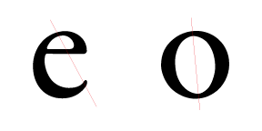
The strokes made a gentle transition from thick to thin, like the broad tipped pen made. Looking at the e, o, the bowl and counter of the p and d, note the thinnest parts of these rounded forms. When thinnest parts are connected by a diagonal line, this angled line is called the stress, oldsyle typefaces have a diagonal stress.

old style lowercase e and o with diagonal stress line through thin parts of letter strokes


Oldstyle typeface classification is a good choice when setting continuous blocks, pages of set type that people can read.


What are some fonts like Myriad Pro?

This query came via email
What are some fonts like Myriad Pro?

Myriad Typeface Family
Many san-serif fonts exist, and that is a broad category for Myriad Pro. It can be further classified as humanist sans-serif. It is a recent font and has its roots as mentioned in Friutiger. Gill Sans is another san-serif font influence, same can be said of Helvetica, Optima, all fonts that were in use and existence before Myriad first release in the 1990’s as a Adobe multiple master font, Myriad MM.
Some other similar fonts Segoe UI and Microsoft humanist sans-serif typeface Corbel.
Myriad Pro works as a printed font and works well as legible screen font. Segoe UI, Corbel also are considered legible screen fonts, in that category you could include some other fonts (commissioned by Microsoft or used in office) humanist san-serif;

  • Calibri
  • Candara
  • Tahoma
  • Trebuchet MS
  • Verdana


Another humanist sans-serif legible screen font worth mention is Lucida Grande, this was a Mac OS interface font until couple years ago.
After you check out the listed humanist sans-serif typeface might look into the fonts;
  • Univers (also a Adrian Frutiger design like Friutiger), 
  • San Francisco, 
  • Helvetica, 
  • Folio 

These are all classified neo-grotesque san-serif. 
San Francisco a very recent design too (original 1984 released again 2014 as system typeface), the others all released before Myriad Pro.

Fonts like Myriad Pro are first of the many other humanist sans-serif fonts that work as legible screen fonts, and second those humanist and neo-grotesque san-serif fonts that laid the foundations for it as print fonts.

How do you design a logo to create a distinct brand identity

This query came via email

How do you (design a logo to) create a distinct brand identity?


Brand is peoples perception.


The best way I know is you work with an experienced graphic designer on your identity program, and on your logo which is a part of your company identity program. Brand encompasses these (logo and identity) and so much more. A brand takes a long time, plus hard-work, customers, service, experience, organization. Through collaboration of all the aforementioned and many other people and activities too, a brand might arise.

Ford, Apple Computer, Dania, Kodak, Porsche, Oil of Olay, Lloyd’s of London
All brand names, each has a essence:
american car, inventive technology, modular furniture, family memories, performance car, younger skin, historic insurance.
These are corporate examples and all these complex brands were more then a decade in the brand making.

A part of any brand making takes people like me a graphic designer. I also work on a brand identity with: strategists, marketing directors, creative directors, researchers, advertising planners, web designers/developers, public relations specialists, copywriters. Sometimes the CEO’s sisters cousins dog becomes part of the mix.

Understanding the how of brand, and brand identity or the outward expression of a brand, including its name, trademark, communications and visual appearance requires you doing your due diligence.
Start by reading at least this:
After reading and study, then with a check in hand for 30 minutes of logo/identity/brand consultation time, please contact a professional graphic designer and arrange for your consultation on brand identity.


Brand is peoples perception. Those that buy it, that sell it, that work on it, around it, and in it too.

Friday, January 6, 2017

Logo and Identity

Logo and Identity Process

In the first days of the new year I have been cleaning the studio. Having rediscovered this identity system from very early days, almost 4 decades back and I was thinking about the graphic design process then and today. It occurs to me that even though the tools-technology has evolved the graphic design discovery and design development process remains the same. Now thirty four years later, with all the new and many ways to advertise and promote a business, still the basic project information questions asked and answered face to face is what makes a graphic design project fun work and puts client and designer on the path to achieve a successful logo solution.

This letters and words logo and the eventual business stationery package that was created is based on a very brief but focused 20 minute consultation. 


The above graphic is a a logo specification sheet originally created for a CPA partnership back in 1980’s, as part of the logo and identity package delivered.

A very basic need for a business card was what had started the graphic design project ball rolling.


Ed and Jim stepped into a Rainer Avenue print shop and were brought to the back of the shop past the clanking one and two color duplicator presses and the sometimes blinding plate burning area, into the 10 by 20 foot area that contained a horizontal process camera, drawing board, light-table on top of a flat file cabinet, one standard two drawer file cabinet, t-square, triangles, metal-cork back ruler, pica poles, x-acto knife, brush & pen collection, 1/2 gallon of rubber cement, rubber cement pint jar with brush, push button phone, fax machine, type sample books, paper sample books, sketch pads, roll of tracing paper, pasteup boards and one graphic-artist/camera-operator/stripper-flatter/type-specifier/plate-maker/paste-up/designer, just 6 months out of University, me.

All three of us were both just starting out. After introducing ourselves, one of the first question I asked “do you have a logo?”  The answer being “NO” on the logo question and then the next question was “do you have a company name?” followed by “well what did you write on your business license application?”

Asking Ed and Jim about business with my checklist of 20 questions made possible a face to face conversation of discovery about their business needs, expectations, what major idea they wanted to communicate. Today these question are the same.

Discovery questions about Who, What, Where, When, How…

Who they wanted to communicate to, or the target audience profile in current mar-com terminology. What the business is about, why some one would want it, can you support that, who is your competition, and what about them. Then on to the creative consideration and direction the defining questions.

The telling question “If you could choose only one thing the viewer would remember what would it be?”
The key follow up questions:
What are you trying to communicate, and why? 
Who needs this information and why?
What does this audience already know?
What does this audience need to know?
What single, unique, focused message should the audience walk away with after reading this piece?
What have you done to communicate this information before?
How do you expect your audience to respond to this communication? How will you in turn respond to your audiences response?
Will the audience receive the same information in any other form or media from your organization as part of a campaign?
Does the audience want this information? Do they not want it? Do they care?

These common kind of project question were the ice breakers to getting the client talking about their business dream, and as a designer a method for gathering valuable insight. It seemed back then a basic trust was built in this first twenty minute face to face conversation.

With four followup meetings to explain and review designs concepts, colors, discuss paper choices, and the rest of the project details, a utilitarian and simple but appropriate letters and word logo graphic design solution resulted.

See Below

Whats the name of this font?

This query came via email

Whats the name of this font?


The example displays the typeface family known as Didot. A typeface that is Indeed older, 200 years plus, so Didot has some history.
I think this example is Didot LH Headline the Linotype version. A version was updated in 1992 for Linotype by Adrian Frutiger a type designer of some renown. Currently a version is published by Adobe. Several other versions are out in world today, Hoefler Type Foundry has a version, other sources are Canada Type, and Monotype.
Didot is a family name and dates from 18th century, France. This family owned a notable print shop and font foundry.

Great Font!

Converting CMYK values to RGB and hex values. Is there a best practice?

This query came via email

Color Management

Looking for some advice when converting CMYK values to RGB and hex values. Is there a best practice? Obviously there are several different ways to get numbers but they don't all give you the same answers. Any ideas?


“Is their a best practice?”

Color management in my studio work flow started with color calibrating, creating ICC profiles of all the tools. A spectrophotometer is the tool that will do all you need in your studio. With this you create ICC profiles of your monitor, scanner, camera, printer & papers, all these input and output devices you use. You have to keep these different kinds of profiles current.  Big part of CM is be consistent in updating ICC profiles and then creating project files. The goal is take control and to match the colors of the image displayed on your monitor with the ones produced by your in-house printers and all outside print venders.

The question of going from CMYK to RGB is a workflow practice choice. At times the choice is not given.

CMYK to RGB

This is not a good practice the color space of CMYK file is different and smaller then a RGB larger color space. So going CMYK to RGB you have gaps. The color gamut of the computer screen and CMYK file gamut may not make an accurate translation. The converted CMYK image may look unsaturated.

This is a best practice.

An original file with RGB profile becomes the master, the converted to cmyk version or even a SRGB version a child.

Industry standard is use ICC profiles and an RGB-centric workflow. In this best practice model, source artwork stays in a large, standard RGB working space for as long as possible. All color corrections are performed in this space, converting color only when targeting for various final outputs that may include websites, high-quality inkjet printing, and printing on press.

So when you can not get that master-RGB file, and you have to convert CMYK to RGB.

Use the “convert to profile” under the edit menu technique.
The best you can do is control your product, your art-file output, so calibrate, profile equipment, tag your files, practice consistent workflow in your work.
 

Worst case when no icc profile exist in the cmyk file you have to convert.

Untagged CMYK file, go ahead use “convert to profile” technique. Next make corrections as needed, then make a proof print. Meet with and explain situation, and have client sign approval on the proofed color print.
Your work is still better then those that don't use CM and tag their files. When you practice good CM you know that what you see on your monitor is accurate.
Those that don’t practice color management are just cutting overripe tomatoes with a dull butter knife.

Great information and resources here: